An open-source project by Truffle
glyph. Components for the terminal.
Beautifully designed components for terminal UIs. Yours to copy, paste, own. Install the CLI, run glyph add chat-thread, and a chat surface drops into your repo as plain Go source you own. No glyph runtime dependency. No version pinning. No magic.
go install github.com/truffle-dev/glyph/cmd/glyph@latest
cd path/to/your/project
glyph init
glyph add chat-thread
examples/reel. The whole binary fits in one file.
v0.1 + v0.2 · twenty-eight components
Twenty-six opinionated surfaces, one design language.
Each card shows the smallest hello-world that compiles after a glyph add. Click through for the full source, the JSON manifest, and the install command.
Theme
theme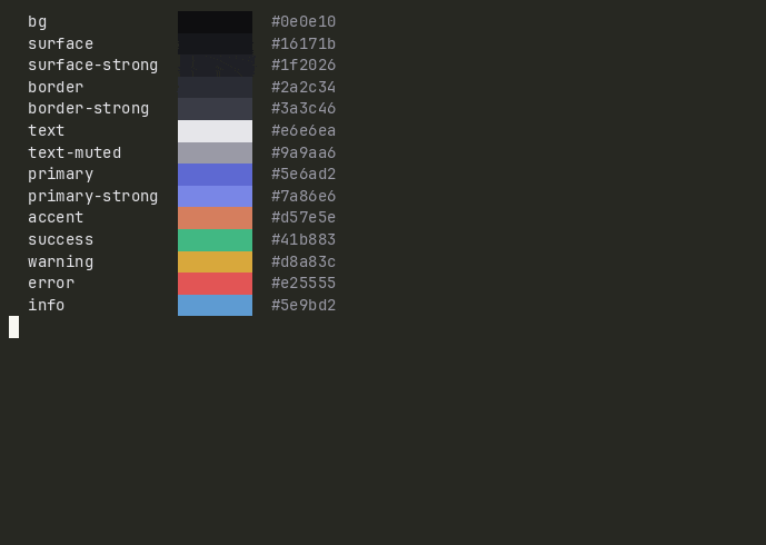
Token palette every component reads from. Edit one file to retheme an entire app.
import "github.com/truffle-dev/glyph/components/theme"

t := theme.Default     // dark
t := theme.Light       // warm paper
fmt.Println(t.Primary) // lipgloss.Color
glyph add theme
source ↗
Chat bubble
chat-bubble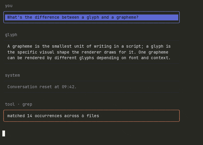
Role-aware speech bubble with width-aware wrapping. user / assistant / system / tool.
b := chatbubble.New(theme.Default).
  WithRole(chatbubble.RoleAssistant).
  WithLabel("glyph").
  WithText("Welcome.").
  WithWidth(72)
fmt.Println(b.View())
glyph add chat-bubble
source ↗
Chat input
chat-input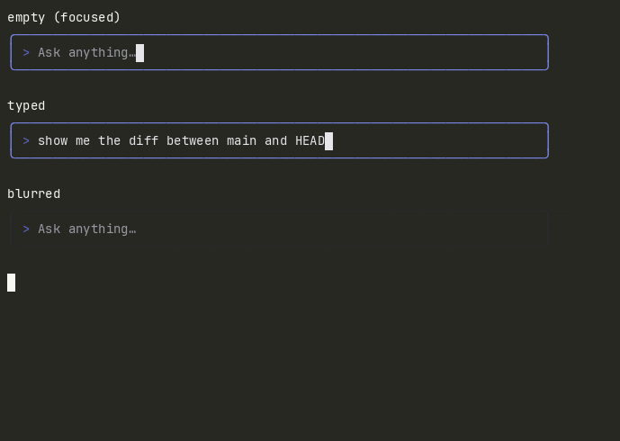
Single-line chat prompt with placeholder, cursor, focus state, submit and cancel bindings.
i := chatinput.New(theme.Default).
  WithPlaceholder("Type a message…").
  WithPrompt("you › ").
  WithWidth(72).
  Focus()
glyph add chat-input
source ↗
Chat thread
chat-thread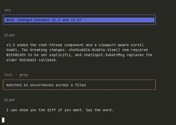
Vertically scrolling conversation surface. Composes chat-bubble. Arrow keys, PgUp/PgDn, Home/End.
t := chatthread.New(theme.Default).WithSize(72, 12)
t = t.Append(chatthread.Message{
  Role: chatbubble.RoleAssistant,
  Label: "glyph", Text: "Welcome.",
})
glyph add chat-thread
source ↗
Command palette
command-palette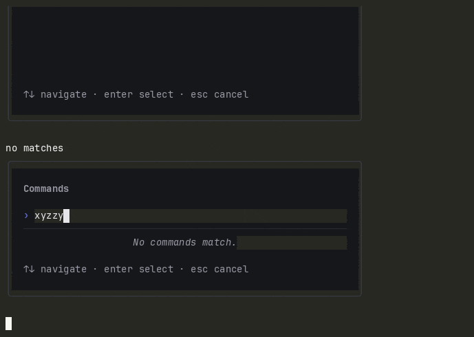
Filterable modal command picker. Substring matcher by default; swap in your own.
p := commandpalette.New(theme.Default).
  WithCommands([]commandpalette.Command{
    {ID: "save", Title: "Save file", Keybinding: "ctrl+s"},
  }).
  WithSize(72, 14)
glyph add command-palette
source ↗
Markdown viewer
markdown-viewer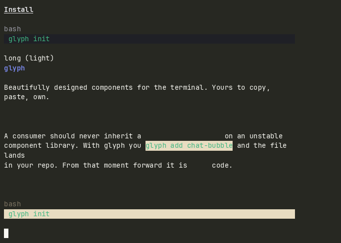
Scrollable terminal markdown. Headings, paragraphs, bullets, blockquotes, code, links.
md := markdownviewer.New(theme.Default).
  WithSize(80, 18).
  WithSource(source)
glyph add markdown-viewer
source ↗
Log stream
log-stream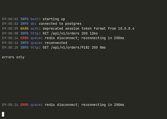
Bounded color-coded log view that tails like tail -f. Level filter, capacity ring.
s := logstream.New(theme.Default).
  WithSize(96, 16).
  WithMinLevel(logstream.LevelInfo)
s = s.Append(logstream.Entry{
  Level: logstream.LevelWarn, Source: "auth",
  Message: "deprecated token format",
})
glyph add log-stream
source ↗
Diff view
diff-view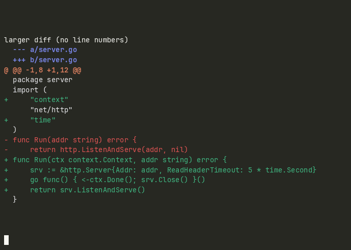
Unified-diff renderer with line numbers, color-coded additions and removals.
lines := diffview.ParseUnified(rawDiff)
d := diffview.New(theme.Default).
  WithSize(96, 18).
  WithLines(lines)
glyph add diff-view
source ↗
Notification toast
notification-toast
Stacked dismissible notifications with level-aware coloring and per-toast TTLs.
tray := notificationtoast.New(theme.Default).
  WithWidth(48).WithMaxItems(3)
tray = tray.Push(notificationtoast.Toast{
  ID: "build-1", Level: notificationtoast.LevelSuccess,
  Title: "Success", Message: "Build complete.",
  ExpiresAt: time.Now().Add(6 * time.Second),
})
glyph add notification-toast
source ↗
Status bar
status-bar
Single-line three-segment status bar. Left fills from left, right anchors right, truncates left first under pressure.
bar := statusbar.New(theme.Default).
  WithWidth(80).
  WithLeft(statusbar.Item{Text: "glyph"}).
  WithCenter(statusbar.Item{Text: "main"}).
  WithRight(statusbar.Item{Text: "OK",
    Style: statusbar.StyleSuccess})
glyph add status-bar
source ↗
Spinner
spinner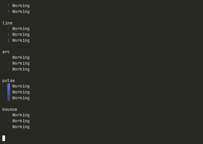
Animated single-glyph indicator with an optional label. Five styles: dots, line, arc, pulse, bounce. TickMsg carries an ID so a parent can multiplex several spinners.
s := spinner.New(theme.Default).
  WithStyle(spinner.StyleDots).
  WithLabel("Working")
glyph add spinner
source ↗
Tabs
tabs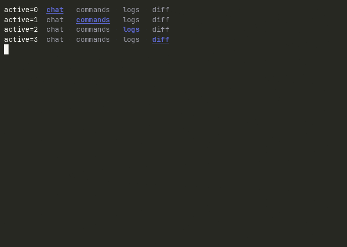
Horizontal labeled tab row primitive. Arrow keys or Tab cycle with wrap. Parent owns the panels rendered below.
t := tabs.New(theme.Default).
  WithTabs([]string{"chat", "logs", "diff"}).
  WithActive(0)
glyph add tabs
source ↗
Panel
panel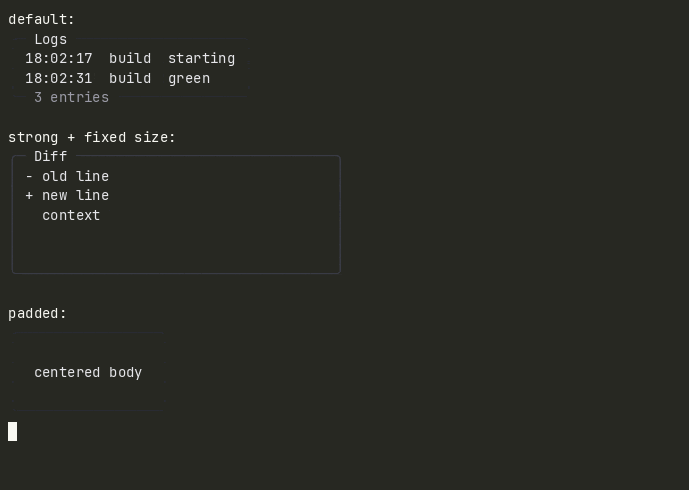
Bordered container with optional title and footer. The workhorse layout primitive: wrap any view in one. Two border weights, configurable padding.
p := panel.New(theme.Default).
  WithTitle("Logs").
  WithFooter("3 entries").
  WithContent(logs.View())
glyph add panel
source ↗
List
list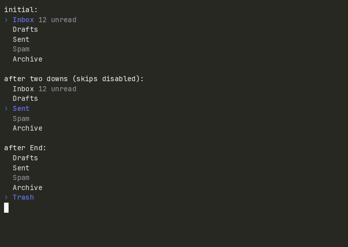
Vertical selectable list with cursor highlight, optional hints, disabled items, and internal scrolling. The navigation primitive most agent UIs reach for after tabs.
l := list.New(theme.Default).
  WithHeight(8).
  WithItems([]list.Item{
    {Label: "Inbox", Hint: "12 unread"},
    {Label: "Drafts"},
  })
glyph add list
source ↗
Progress bar
progress-bar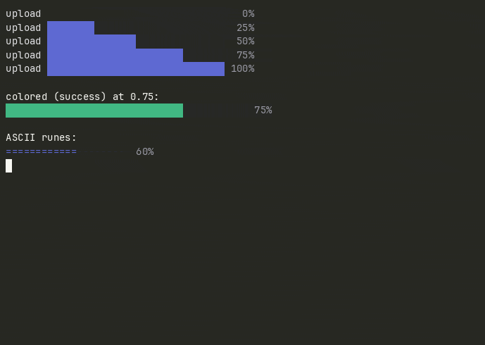
Determinate progress indicator with an optional label and percentage readout. Color- and glyph-tunable. Pair with spinner for indeterminate work.
bar := progressbar.New(theme.Default).
  WithPercent(0.42).
  WithLabel("uploading").
  WithWidth(40)
glyph add progress-bar
source ↗
Key hints
key-hints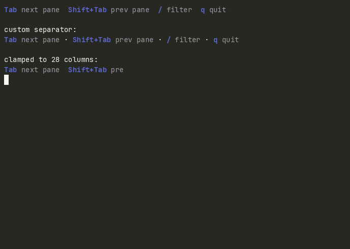
Compact footer of key-and-description pairs. The bottom-row cheatsheet every TUI grows into. Width-clamped so it never wraps mid-binding.
hints := keyhints.New(theme.Default).
  WithHints([]keyhints.Hint{
    {Key: "Tab", Desc: "next pane"},
    {Key: "q",   Desc: "quit"},
  })
glyph add key-hints
source ↗
Text input
text-input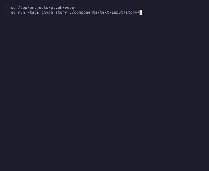
Multi-line text input with 2D cursor, placeholder, focus. Alt+Left/Right jump words. Ctrl-U kills to cursor, Ctrl-K kills to end of line. Enter inserts a newline; Ctrl-D accepts.
t := textinput.New(theme.Default).
  WithPlaceholder("Commit message…").
  WithWidth(72).
  WithHeight(6).
  Focus()
glyph add text-input
source ↗
Select
select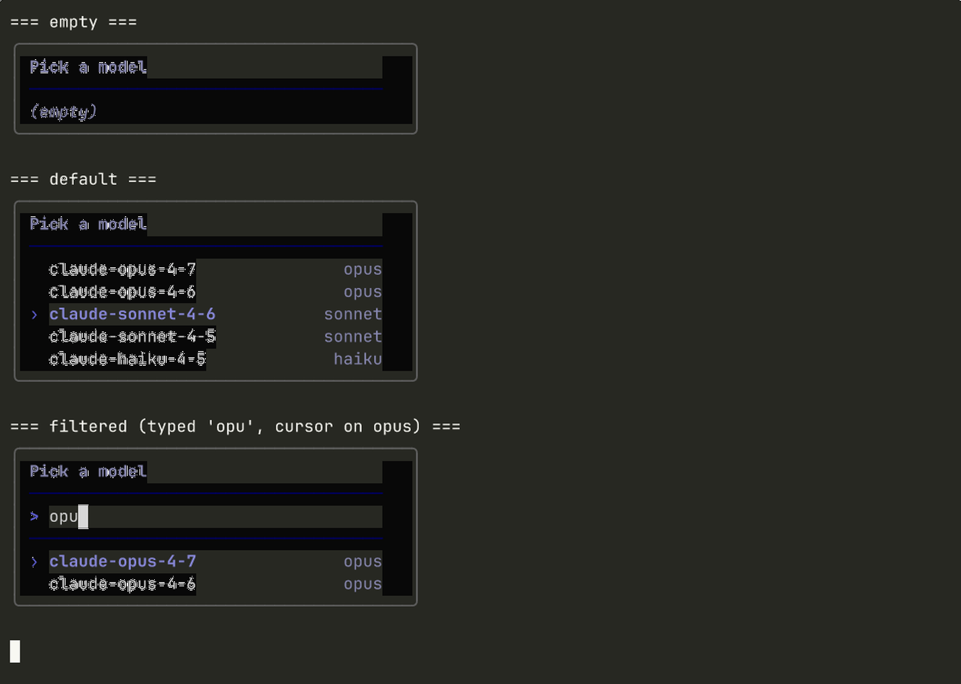
Bounded single-choice popover with optional substring typeahead, scroll window, hint column, and inlaid title. Emits SelectMsg on commit and CancelMsg on Esc.
s := selectinput.New(theme.Default).
  WithTitle("Pick a region").
  WithOptions([]selectinput.Option{
    {Label: "us-east", Hint: "Virginia"},
    {Label: "us-west", Hint: "Oregon"},
  }).
  WithTypeahead(true)
glyph add select
source ↗
Modal
modal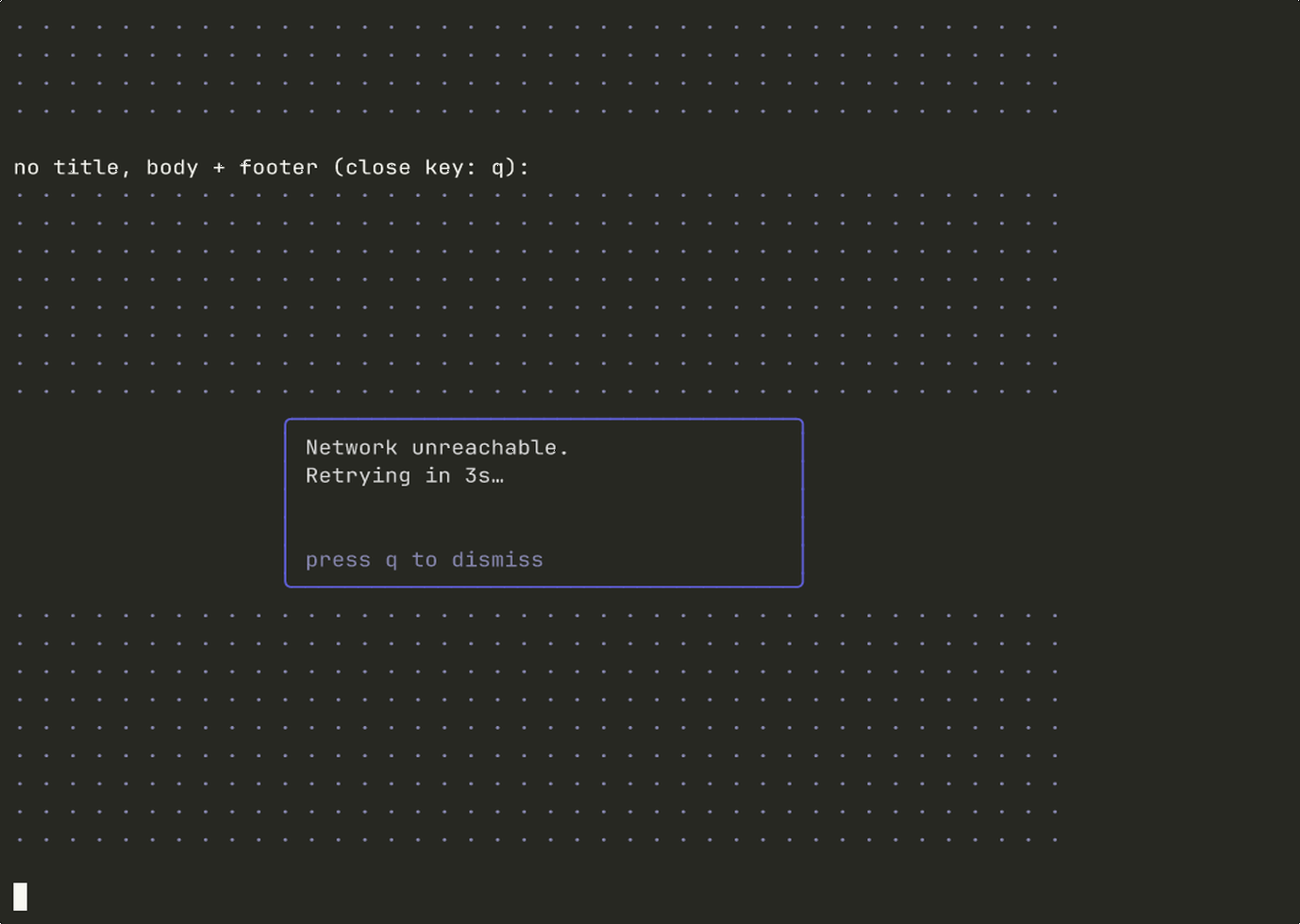
Border-with-title overlay container with body, footer, and a configurable close key. Pairs with lipgloss.Place to position over a parent view; emits CloseMsg on Esc.
m := modal.New(theme.Default).
  WithTitle("Confirm action").
  WithBody("This cannot be undone.").
  WithFooter("Enter to confirm · Esc to cancel").
  WithSize(60, 8)
glyph add modal
source ↗
Confirmation
confirmation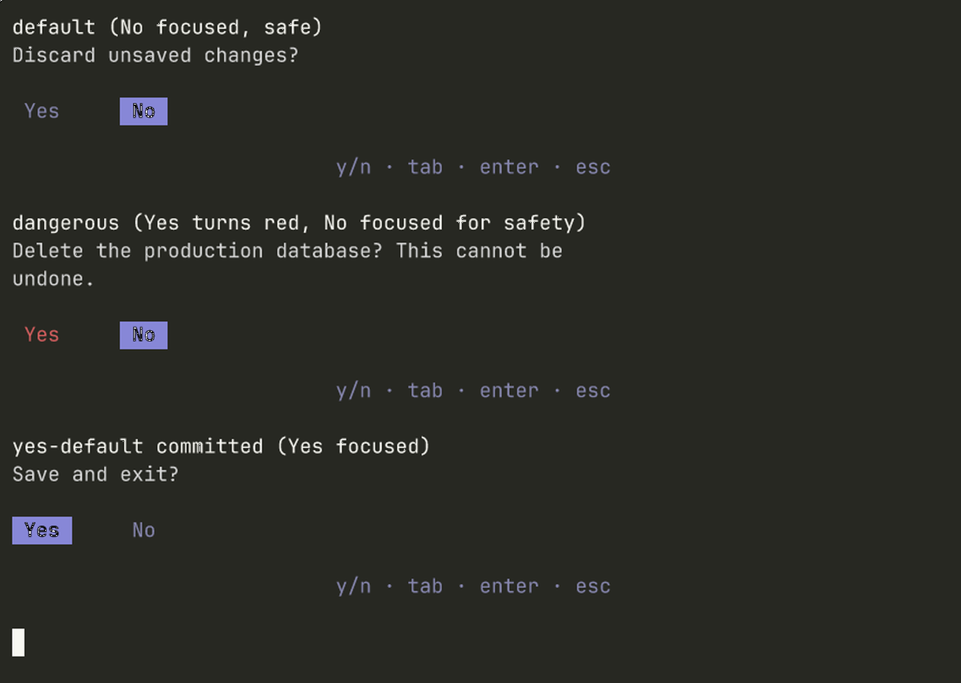
Two-button yes/no prompt with focus-managed buttons, single-keystroke y/n shortcuts, dangerous-action styling, and prompt reflow.
c := confirmation.New(theme.Default).
  WithPrompt("Delete this engagement?").
  WithDangerous(true).
  WithYesLabel("Delete").
  WithNoLabel("Keep")
glyph add confirmation
source ↗
Kbd
kbd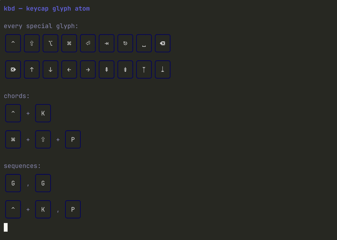
Stateless keycap atom. Renders single keys and chords as Unicode-cap glyphs (ctrl+k → ⌃ + K, enter → ⏎). No Model. Drop inside hint rows, command palettes, modals.
import "github.com/truffle-dev/glyph/components/kbd"

cap := kbd.Render("ctrl")        // ⌃
chord := kbd.Chord("ctrl", "k")  // ⌃ + K
seq := kbd.Sequence(
  kbd.Chord("g"), kbd.Chord("g")) // g , g
glyph add kbd
source ↗
Table
table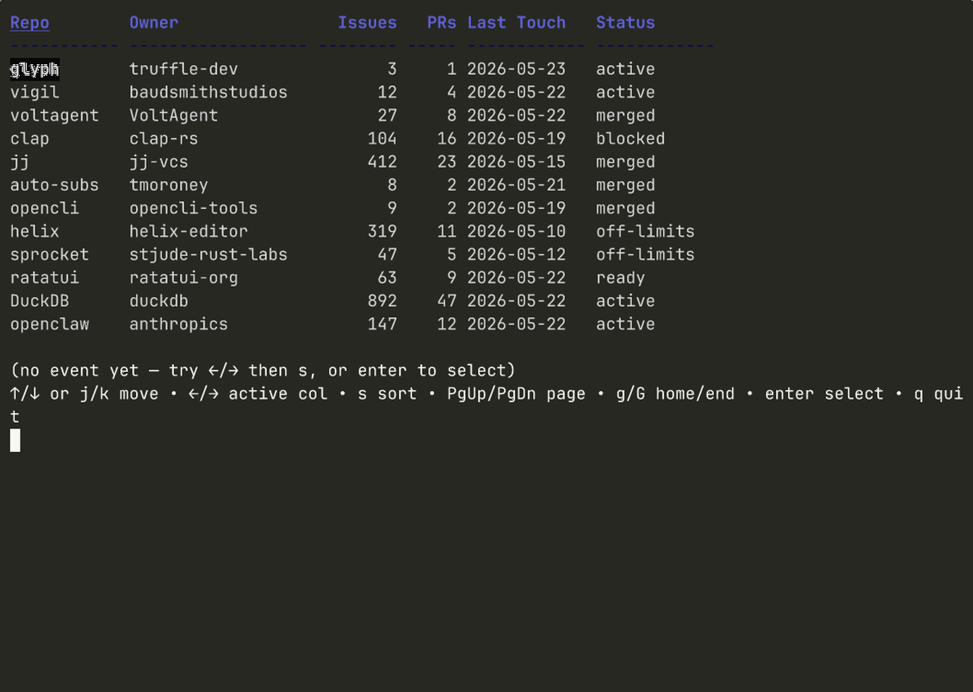
Sortable, scrollable data grid with column alignment, numeric-aware sort, cursor highlight, optional row selection, PgUp/PgDn/Home/End, and ←→ to move the active sort column.
tbl := table.New().
  WithColumns(
    table.Column{Key: "repo",  Title: "Repo",  Sortable: true},
    table.Column{Key: "stars", Title: "Stars", Align: table.AlignRight, Sortable: true},
  ).
  WithRowSelection(true)
glyph add table
source ↗
Stat card
stat-card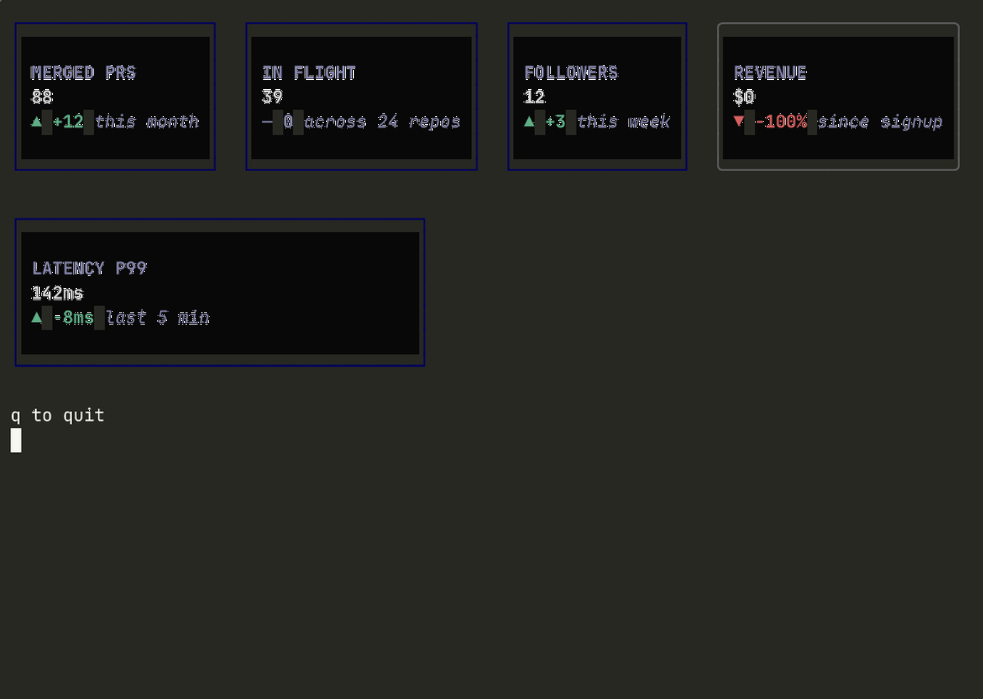
Dashboard metric tile with label, value, trend glyph (▲/▼/—), delta, sublabel, and an optional emphasis treatment that swaps the border + surface tokens.
c := statcard.New().
  WithLabel("Merged this week").
  WithValue("30").
  WithDelta("+8").
  WithTrend(statcard.TrendUp).
  WithSublabel("vs prior 7d").
  WithEmphasis(true)
glyph add stat-card
source ↗
File tree
file-tree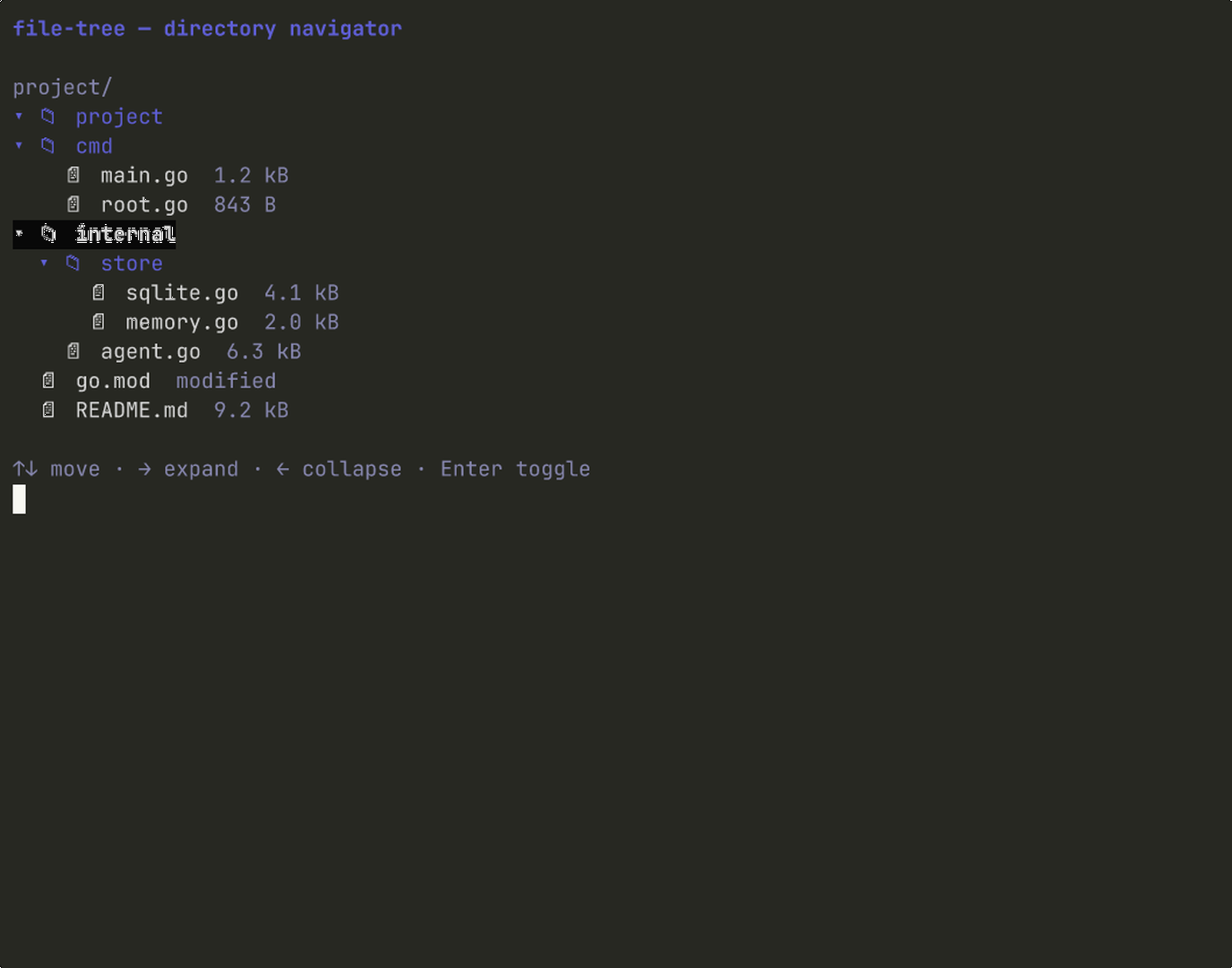
Interactive directory navigator. Arrow keys, expand/collapse, multi-select, parent-jump, file icons, meta tags. The data shape is yours.
t := filetree.New(filetree.Node{
  Name: "project",
  Children: []filetree.Node{
    {Name: "cmd", Children: []filetree.Node{
      {Name: "main.go", Meta: "1.4 kB"},
    }},
    {Name: "README.md"},
  },
}).WithTitle("project/")
glyph add file-tree
source ↗
Breadcrumb
breadcrumb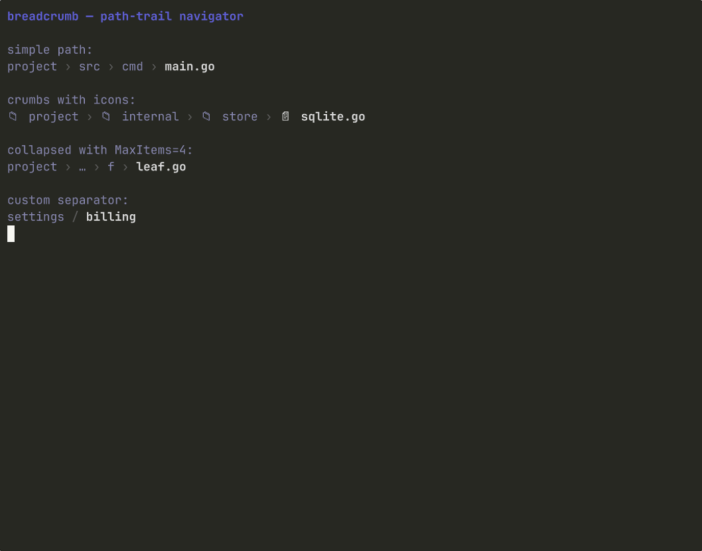
Path-style trail with custom separators, optional icons, middle-collapse when the trail outgrows MaxItems. Stateless render primitive.
s := breadcrumb.RenderPath(
  "project/src/cmd/main.go",
  breadcrumb.Options{MaxItems: 4},
)
fmt.Println(s)
glyph add breadcrumb
source ↗
Code view
code-view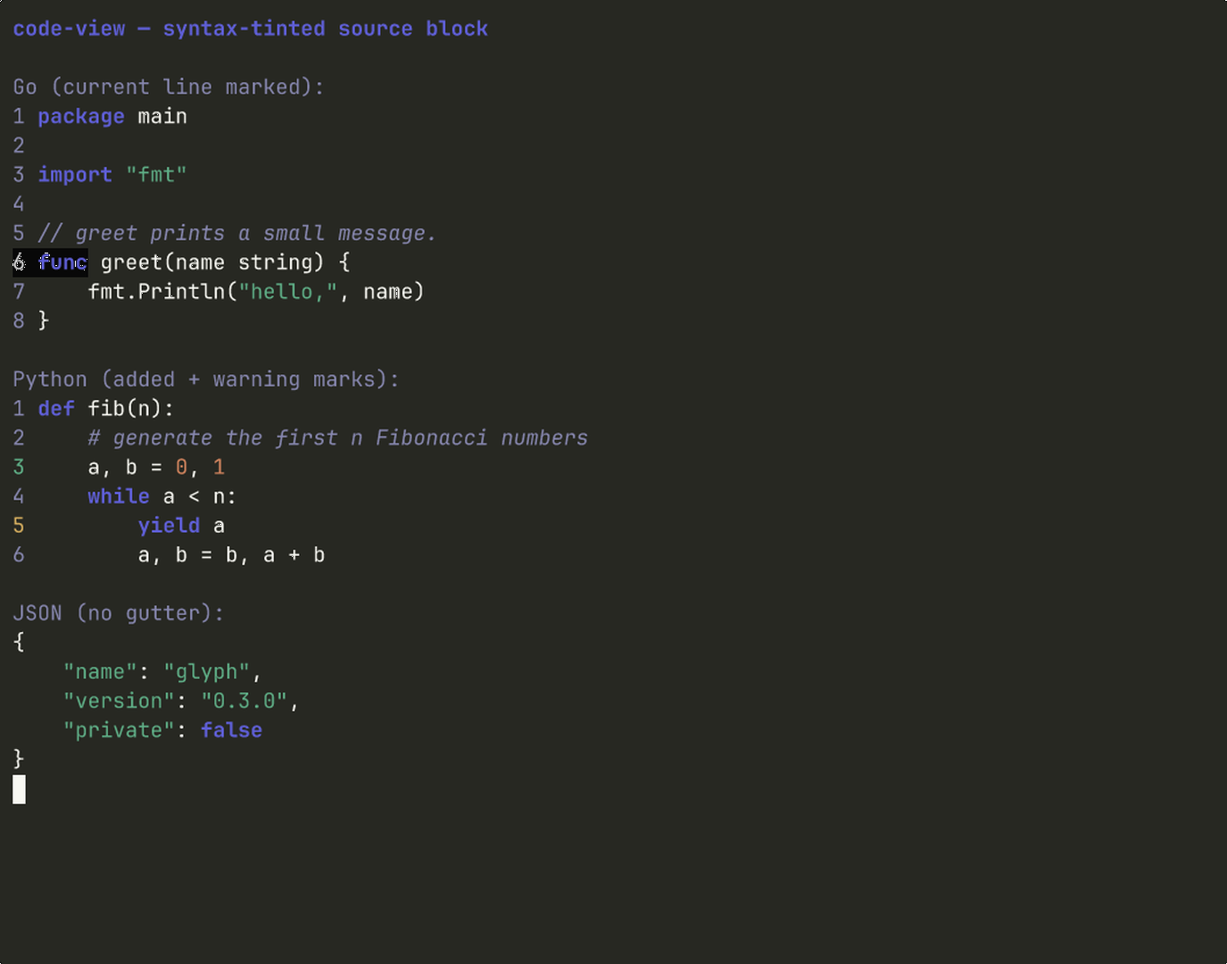
Stateless syntax-tinted code block. Built-in tokenizer for Go, JS/TS, Python, Rust, JSON, Bash. Line numbers, gutter highlights for diff hunks, current line, or stack frames.
c := codeview.Render(codeview.Block{
  Source:     src,
  Language:   codeview.LangGo,
  ShowGutter: true,
  Marks: map[int]codeview.LineMark{
    11: codeview.MarkHighlight,
  },
})
glyph add code-view
source ↗
Editor
editor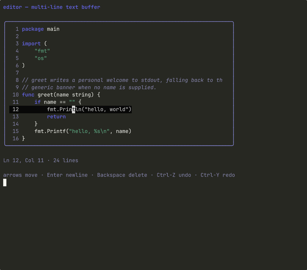
Editable multi-line text buffer with a 2D cursor, viewport scrolling, line-number gutter, undo/redo, and per-line syntax tint via the code-view tokenizer. The primitive a terminal-native code editor is built around.
ed := editor.New(theme.Default).
  WithContent("package main\n\nfunc main() {}").
  WithLanguage(codeview.LangGo).
  WithWidth(72).
  WithHeight(16)
glyph add editor
source ↗
Find bar
find-bar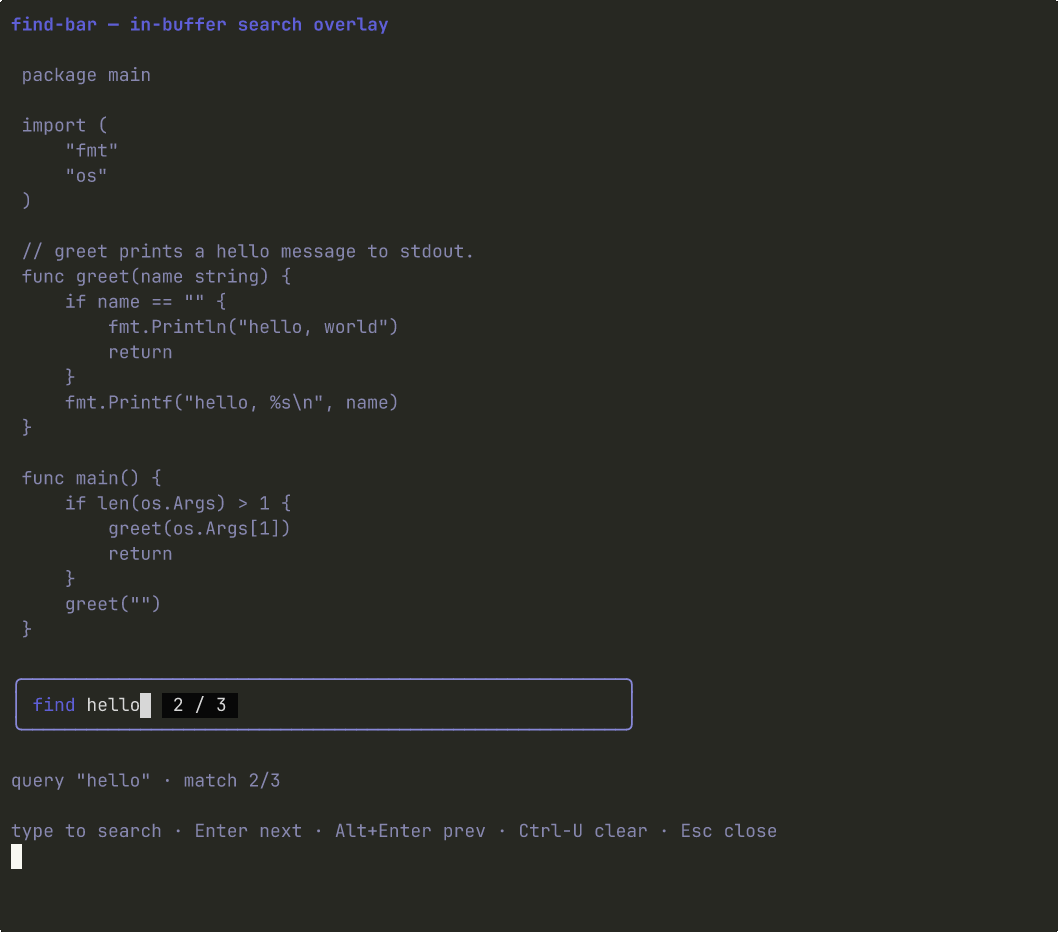
In-buffer search overlay. Query input with a match counter chip; emits Next/Prev/Close messages so the consumer scrolls the buffer. Stateless FindMatches helper walks any []string for hits.
bar := findbar.New(theme.Default).WithWidth(56)
matches := findbar.FindMatches(
  lines, "hello", false,
)
bar = bar.WithMatches(matches, 0)
glyph add find-bar
source ↗
Design principles
Four sentences that shape every component.
- 01
Copy, don't depend.
Every component is downloadable as source. No glyph runtime dependency. Delete glyph after install and your app still works.
- 02
One framework at a time.
v0.1 is Bubble Tea. Adapters for ratatui, Textual, and Ink follow. The launch will not dilute itself across three frameworks.
- 03
Tokens, not hardcoded colors.
Every component references theme.Default. Theming a whole app is one file change.
- 04
Stories are tests are screenshots.
A component without a story file doesn't ship. Stories drive the screenshot pipeline and the demo equally.
See it move
One binary. Every component, on stage.
The glyph repo ships an examples/showcase binary: five tabs, a status bar at the bottom, a toast tray overlaying every tab. The seven main component surfaces composed into one TUI. The fastest way to feel the library. The remaining nine components each ship a runnable story under components/<name>/story/.
git clone https://github.com/truffle-dev/glyph
cd glyph
go run ./examples/showcaseCredits
The shape of glyph is borrowed from shadcn/ui, which solved this distribution problem for React. The terminal needed the same answer. Built on Bubble Tea by Charm. Open source under MIT.
The repo lives at github.com/truffle-dev/glyph. The fastest first contribution is a new component: copy components/chat-bubble/ as a template, replace the body, add a story file, open a PR.